This the most recent purchase of my life. I have always wanted a Pendelton blanket they are just so warm and have the best designs ever, so when I got my tax return a week or two ago I decided it was time to cross this purchase off my wish list. I really like the blanket I chose there were tons of awesome designs but I just love the colors in this one.
Wednesday, April 10, 2013
Response: Trends Assignment
I really enjoyed "parts" of this assignment. I was great to catch up with an old classmate and here him talk about how much he enjoys hi job and how much he has learned since he left to join the real design world. It was also made me want to get out there and start increasing the number and quality of my own design skills.
It just seems so awesome to make a living creating these gorgeous layouts and imagies and that people are paying to look at something you designed. It was just fun to hear what that was like.
I will say that the assignment also has been one of the worst assignments of my college history. I have never had to transcribe an interview much less a 30 minute interview and it was utter hell. I know I am not the fastest typer by any means and that I key typos all the time, so ya I was probably a little bit slower than your average student. It took me like 3 hours to get that thing done and I was so happy once I was. I hope that is the last time I am asked to do that but I am sure knowing my luck it wont be. Hopefully we can get better voice recognition technology by then and I will be able to just play the interview for my computer and it will totally take care of it for me.
Critique: Feature for Meredith
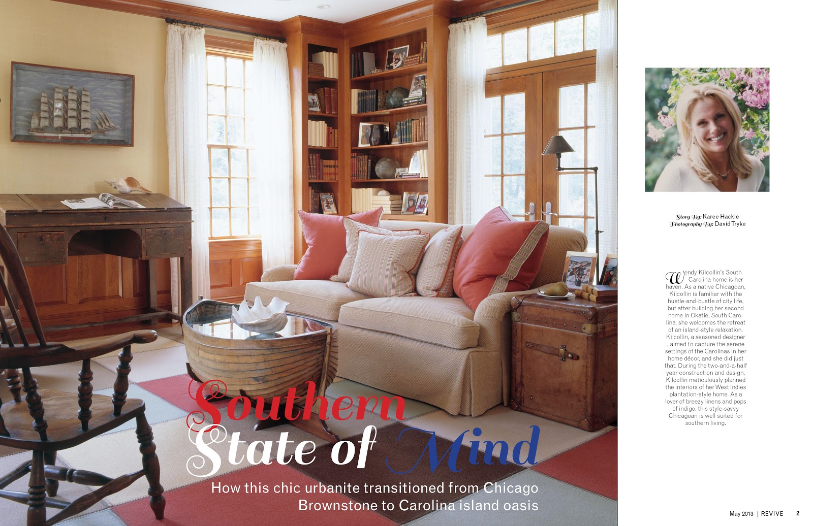
So I have made a few changes to my feature pages for the meredith project. One of the big changes was that fact that I had to shorten the design by two entire pages. I also took some pointers from other people in the class and put the dek under the hed on the photo which actually looks pretty solid. I thought originally it would look a little squished, but it looks fine. I also resized the photo of the women and the text in the white free space next to the photo. I cant tell if it is to much white space or not I will have to wait on feedback I suppose.
We also might be completely changing the photos to better match the story if we can find a set of photos that will work. Guess you all will have to just wait to see what we decide to do next.
I also feel I should try to work with the publishers to see if I can get those two pages back. I don't feel that four pages is a typical length for a feature in a a magazine it just seems short to me.
Wednesday, April 3, 2013
Photo Inspiration: Appalachian Trail
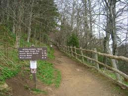
Here is a photo of the Appalachian Trail. I am planning on hiking it soon and just looking at photos of how beautiful it is makes me want to skip forward to that part of my life where I can do something that few people have had the chance to do.
Cant Miss: Georgia Bulldogs "Apparently Old Dogs Can Learn New Tricks"
Mizzou athletics recently revitalized there entire sports appearance by changing logos and fonts and everything in-between. It looks like their fellow SEC schoolmates the Georgia Bulldogs are doing the same in hope of boosting their stance in being noticed in the SEC.
Here are a look at some of the changes:
You can see they mostly just wanted something a little more youthful. I like the new design much more than the old design. They left the famed G alone for the most part which I think was a great idea because I feel most people associate the G with the school as its symbol. The bulldog is the mascot but it was dated and needed a revival.
Response: Mock Magazine Presentation
I think that our presentation went really well. I wish that we would have had more time to discuss things because I feel we didn't have enough time to really talk about each individual story and get a feel of what the publishers really thought of each spread. I know there was good feed back and small changes for each spread, but I feel the publishers also held back a little and didn't really let us designers know exactly what they felt about things. I feel though that we are working really close with our publishers, so we will get plenty of time to talk to them and figure out exactly what they want. Revive is apparently the furthest ahead when it comes to content and having things do, so that is nice and makes me feel good about where the magazine is now. I think that be the time we head to Des Moines we will be in really good shape and everything will look great.
Critique: Revive Feature
I enjoy the feature spread I have created for the Revive mock magazine, but I still believe it needs work. I feel like my design may or may not be a little to traditional for the feel of the rest of the magazine. I just got the vibe of a good souther country style house was what was being described when I read the article. I like the font choice and color for the title but I also don't think that it keeps the consistency of the magazine, so I am sure that we will possible need to change that.
The photos actually work well together but after talking to the publishers we might be getting all new photos so we will have to wait and see. The only thing that I don't like about the layout is I am having a hard time deciding how to handle the dek for the story. IF you have some suggestions I am all ears. It just looks so lost and out of place where it is now.
Subscribe to:
Posts (Atom)