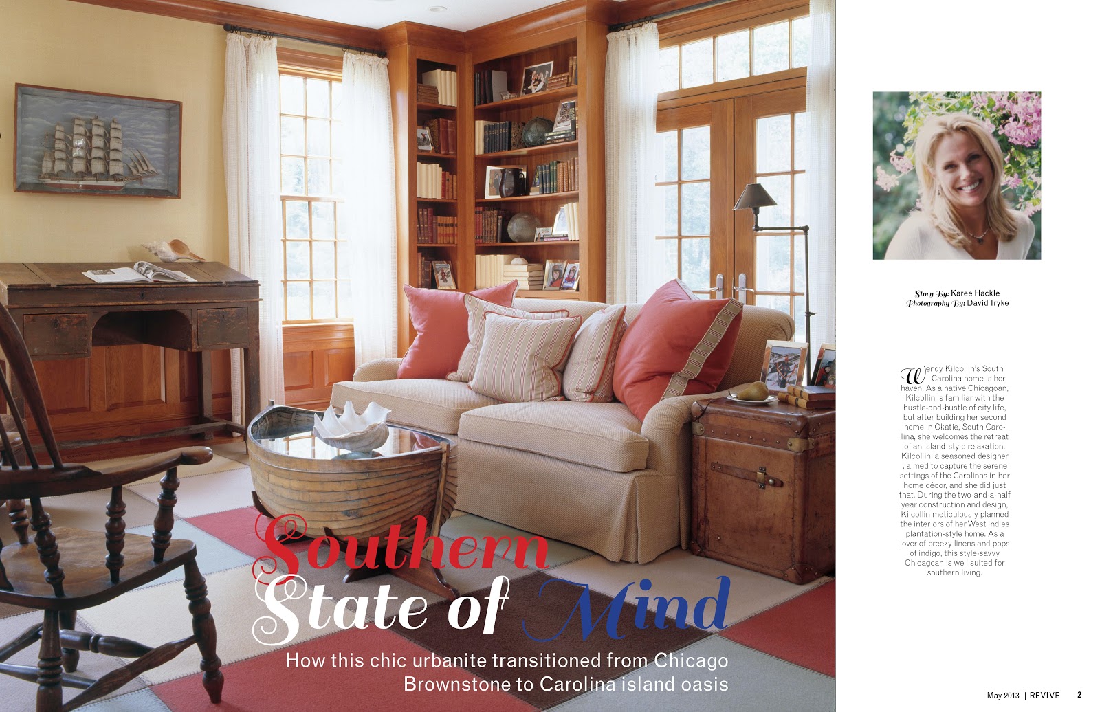
So I have made a few changes to my feature pages for the meredith project. One of the big changes was that fact that I had to shorten the design by two entire pages. I also took some pointers from other people in the class and put the dek under the hed on the photo which actually looks pretty solid. I thought originally it would look a little squished, but it looks fine. I also resized the photo of the women and the text in the white free space next to the photo. I cant tell if it is to much white space or not I will have to wait on feedback I suppose.
We also might be completely changing the photos to better match the story if we can find a set of photos that will work. Guess you all will have to just wait to see what we decide to do next.
I also feel I should try to work with the publishers to see if I can get those two pages back. I don't feel that four pages is a typical length for a feature in a a magazine it just seems short to me.

I like your spreads a lot. Your body text is very nicely organized and spacing looks very clean, especially on the second spread. I like your color choices as well. I am excited to see everyone's final presentations for Meredith.
ReplyDelete