Wednesday, April 24, 2013
Response: Folio Critiques
After looking at peoples from other responses since I was not able to actually be in class due to sickness I feel I am a little behind there are so many good designers in this class. I am glad cause it really pushes you to be a better designer in the long run. I def need to work on my portfolio more and sharpen it up before I go out on the job hunt.
Photo Inspiration: Spring Cleaning
A week or so ago I decided to the spend the afternoon cleaning off my houses back porch. I was full of trash and boxes that had collected over the winter. Since it has been so nice lately I wanted to be able to enjoy the weather outdoors. It took like 4 hours to get it looking halfway decent, but it was so nice to sit down and have a glass of tea and enjoy the warm sun and gentle breeze.


Can't Miss: Fun Food Logos.
I dont know if you have noticed yet but my blog I follow for class mostly focuses on brand recognition and logos. They did a short story on a few of there favorite up and coming logos in the food industry. I love how industrial they are and just how clean the first two are compared to the personality of the third one. It is almost hand drawn. I really like all three but I think my personality lends itself to the third one for sure. Check out the whole article and see my photos on the blog. http://www.underconsideration.com/brandnew/archives/friday_likes_41.php


Critique: Taxidermy Feature
Here is the mostly finished taxidermy feature there still might be some minor tweaks but for the most part this is it. I think that all and all it turned out well. It was a pretty simple feature because the photos were so great you didnt want to distract from them to much you wanted to give them room to breathe and shine. We used a light blue to represent the freezing aspect at least in my mind that is what the color stood for. I tried to take some risk in the early rough drafts by adding a fur color and texture to the tagline and a cooler to the side bar, but they were not the most well received so we made some changes and this what the feature came out looking like. I like it. I feel it is a little bare but it is clean with a sophisticated amount of white space.


Wednesday, April 17, 2013
Photo Inspiration: Coming Together
This is a photo of one of my best friends of all time.This is pre-race, but she finished the Boston Marathon about 25 min before the bombs went off and was just blocks down the street. I am so thankful that she is ok and my thought go out to the families of those who were injured. I chose this photo because it was so amazing to see how quickly people reacted and the acts of kindness you saw on TV after the incident. It is sad that it takes moments like this to bring everyone one in country together, but it is nice to see everyone come together.


Can't Miss: UC. Quarterly
The blog that I follow for this class has just released a new magazine. It is called UC. Quarterly. It follow all the blogs under the Underconstruction websites. There are four different blogs: Brand New, For Print Only, Art of the Menu and Quipsologies. They will put together a 48 page magazine that will have content from al four blogs. It is really great to see that they are putting something out in print. People love going to blogs and seeing great material, but there is just a special connection with holding the art in your hands as you look at it that makes it that much more real. Here are a few pages from the magazine to get a feel of how it will look. Also here is the website handle so you can order if you are interested: http://www.underconsideration.com/brandnew/archives/introducing_ucquarterly.php


Response: Final Meredith Prep
We had our final meeting with the Revive group tonight since we have our final presentation with the publishers on Friday. I think as a whole we are in pretty good shape. We still have to work a lot on the iPad part of the magazine, but the magazine is pretty much done. We have some small things to tweak we noticed tonight. It looks really good. the magazine moves and flows well. There is consistency throughout the magazine that we were originally missing, but after sitting down and talking we have fixed those errors. I am excited to see what the publishers have to say and to see if they are happy with the magazine we have put together. I can't believe that we go to print in a week. The semester is almost over and this project finishing up makes you really realize it.
Critique: Taxidermy Feature
Here is the rough draft of my taxidermy feature that will run next week in Vox. It is actually a pretty neat story. They pictures were a little gruesome, but there were enough good pictures to pick from I didn't have to use the bloody mucky ones. I decided to put animal prints in the hed to make it pop a little. After talking with my art director, I am most likely going to nix the exotic prints and use more domestic animal fur patches. The story is pretty short, so I had plenty of room to run some really large photos. I also figured out that I am waiting on a side bar that will really change the flow of the spreads I am guessing so I will have to work that in once we get it. As of now though this is what I am working with.


Wednesday, April 10, 2013
Can't Miss: Zoo Portraits
I was just stumbling around a designs or art website I really enjoy called Art-Spire. I dont now if I have talked about it here yet, but it is one of the coolest sites I have some across for designing and such. They have great typography, photos, illustrations, and graphs. All the stuff on the site is really top notch stuff.
Anyways was checking out this site and came across these super cute and adorable Zoo Portraits by Yago Partal. It is just pictures of animals in peoples clothing. They are super simple but just so great. I will share a few of my favorite and link the rest casue you all should def look at these photos and this site they are both amazing.


Anyways was checking out this site and came across these super cute and adorable Zoo Portraits by Yago Partal. It is just pictures of animals in peoples clothing. They are super simple but just so great. I will share a few of my favorite and link the rest casue you all should def look at these photos and this site they are both amazing.
Favs:


Check out the rest here.
Photo Inspiration: Pendelton Love

This the most recent purchase of my life. I have always wanted a Pendelton blanket they are just so warm and have the best designs ever, so when I got my tax return a week or two ago I decided it was time to cross this purchase off my wish list. I really like the blanket I chose there were tons of awesome designs but I just love the colors in this one.
Response: Trends Assignment
I really enjoyed "parts" of this assignment. I was great to catch up with an old classmate and here him talk about how much he enjoys hi job and how much he has learned since he left to join the real design world. It was also made me want to get out there and start increasing the number and quality of my own design skills.
It just seems so awesome to make a living creating these gorgeous layouts and imagies and that people are paying to look at something you designed. It was just fun to hear what that was like.
I will say that the assignment also has been one of the worst assignments of my college history. I have never had to transcribe an interview much less a 30 minute interview and it was utter hell. I know I am not the fastest typer by any means and that I key typos all the time, so ya I was probably a little bit slower than your average student. It took me like 3 hours to get that thing done and I was so happy once I was. I hope that is the last time I am asked to do that but I am sure knowing my luck it wont be. Hopefully we can get better voice recognition technology by then and I will be able to just play the interview for my computer and it will totally take care of it for me.
Critique: Feature for Meredith
So I have made a few changes to my feature pages for the meredith project. One of the big changes was that fact that I had to shorten the design by two entire pages. I also took some pointers from other people in the class and put the dek under the hed on the photo which actually looks pretty solid. I thought originally it would look a little squished, but it looks fine. I also resized the photo of the women and the text in the white free space next to the photo. I cant tell if it is to much white space or not I will have to wait on feedback I suppose.
We also might be completely changing the photos to better match the story if we can find a set of photos that will work. Guess you all will have to just wait to see what we decide to do next.
I also feel I should try to work with the publishers to see if I can get those two pages back. I don't feel that four pages is a typical length for a feature in a a magazine it just seems short to me.

Wednesday, April 3, 2013
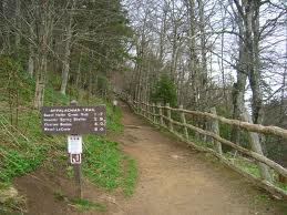
Photo Inspiration: Appalachian Trail
Here is a photo of the Appalachian Trail. I am planning on hiking it soon and just looking at photos of how beautiful it is makes me want to skip forward to that part of my life where I can do something that few people have had the chance to do.
Cant Miss: Georgia Bulldogs "Apparently Old Dogs Can Learn New Tricks"
Mizzou athletics recently revitalized there entire sports appearance by changing logos and fonts and everything in-between. It looks like their fellow SEC schoolmates the Georgia Bulldogs are doing the same in hope of boosting their stance in being noticed in the SEC.


Here are a look at some of the changes:


You can see they mostly just wanted something a little more youthful. I like the new design much more than the old design. They left the famed G alone for the most part which I think was a great idea because I feel most people associate the G with the school as its symbol. The bulldog is the mascot but it was dated and needed a revival.
Response: Mock Magazine Presentation
I think that our presentation went really well. I wish that we would have had more time to discuss things because I feel we didn't have enough time to really talk about each individual story and get a feel of what the publishers really thought of each spread. I know there was good feed back and small changes for each spread, but I feel the publishers also held back a little and didn't really let us designers know exactly what they felt about things. I feel though that we are working really close with our publishers, so we will get plenty of time to talk to them and figure out exactly what they want. Revive is apparently the furthest ahead when it comes to content and having things do, so that is nice and makes me feel good about where the magazine is now. I think that be the time we head to Des Moines we will be in really good shape and everything will look great.
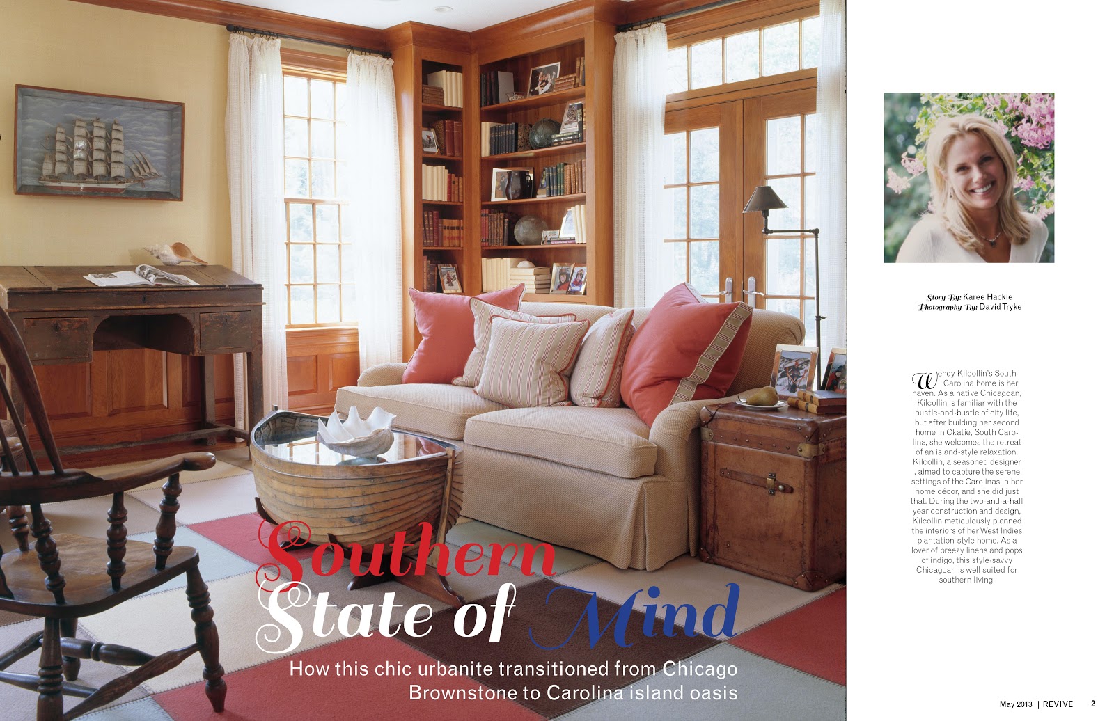
Critique: Revive Feature
I enjoy the feature spread I have created for the Revive mock magazine, but I still believe it needs work. I feel like my design may or may not be a little to traditional for the feel of the rest of the magazine. I just got the vibe of a good souther country style house was what was being described when I read the article. I like the font choice and color for the title but I also don't think that it keeps the consistency of the magazine, so I am sure that we will possible need to change that.
The photos actually work well together but after talking to the publishers we might be getting all new photos so we will have to wait and see. The only thing that I don't like about the layout is I am having a hard time deciding how to handle the dek for the story. IF you have some suggestions I am all ears. It just looks so lost and out of place where it is now.

The photos actually work well together but after talking to the publishers we might be getting all new photos so we will have to wait and see. The only thing that I don't like about the layout is I am having a hard time deciding how to handle the dek for the story. IF you have some suggestions I am all ears. It just looks so lost and out of place where it is now.

Subscribe to:
Comments (Atom)