
Thursday, March 21, 2013
Photo Inspiration: Responsibilities
Cant Miss: Minimalist Movie Posters.
I have recently be doing some side art projects for friends and family. It is called paper cutting I showed a picture of one I did last week. I wanted to share some of the things that inspire me. These are just a few of my favorite minimalist movie posters from one web page. There are thousands of posters floating around out there. I just love how clean and neat they are.


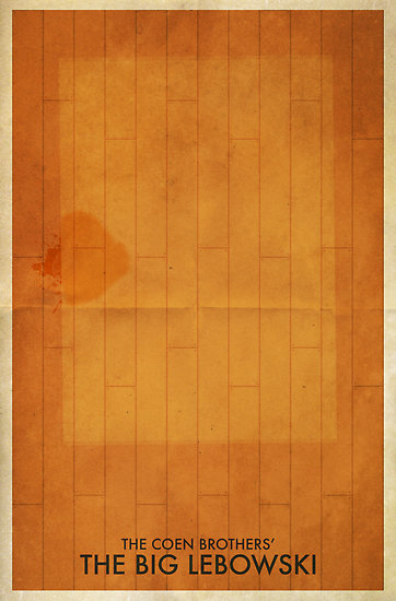

I mean these are all great movies as well so that helps. I have attached a hyperlink at the bottom to the website I found these at, but they are all over the web. They are a great source of inspiration and they are extremely popular now as well. Go out there and check some out.
Response: The September Issue
I was not in class to watch this movie with the group, but I have seen in a few times already. I really enjoy this movie it is a great look at what the magazine industry is like in a very successful magazine. I love the interactions between Anna Wintour and GRace Coddington. It was fun to see these two almost fight like sisters. You can tell they both have tremendous respect for one another. but both are strong and successful women who at times feel they are right and are willing to fight to get what they want. This movie also gives a good insight into the designing aspect of the movie. I just love listening to Coddington in this movie. It is such a great movie and anyone who wants to be in this industry should definitely watch it. Also fun fact the september issue that was made during this filming has become a collectors item. It is worth like $100 dollar now.
Critique: Older Designs
It has been a slower week for me when it comes to designing. It is the last few days before spring break so of course I have had the worst head cold I have had all winter, so I don't mind the lighter work load. Since I didn't have much to design I am going to show a few older designs and maybe my fellow classmates will be able to give me a few pointers on how I can make the designs a little sharper. I am always looking for pointers to make my clips better. That is one thing I really enjoy about this profession is your clips can say so much about you and really help you get a job even if you don't have that much experience.


Here some older designs I wanna tweak:


The first two were concept covers for for a story about a woman who got rid of almost all her possessions to life a simpler and cleaner lifestyle.
The third was a story that focused on how different professors dressed on campus. This is the splash page of the feature story.
The last is my final project for a photography class. I actually took all the picture in the spread and designed the spread as well.
I would love feed back on all the designs from anyone.
Thursday, March 14, 2013
Photo Inspiration: David Bowie
Here is a picture of a paper cut art piece that I did last week for my girlfriend who really loves David Bowie. I enjoy making art, but I just dont have time to create new things right now. I have another three or four already planned just have to find the time to make them

Cant Miss: Logo Redesign for Hudson Bay
Hudson Bay, previously know as The Bay, the most successful and established department store in Canada and the longest running department store in North America decided that it was time to redesign there logo. I really enjoy the new logo and think that it is interesting that a company that is obviously successful thought it was a good idea to change their logo. Apparently you are never to well established to bring some new life into a company.
I also like the fact they put three very Canadian creatures into their logo. Doesnt get much more Canadian than a moose.


I also like the fact they put three very Canadian creatures into their logo. Doesnt get much more Canadian than a moose.
Here are some of the redesigns:
As you can see the new type logo is much cleaner and distinguished. I prefer it much more.
Response: Portfolio Reviews
I was a little nervous about doing portfolio review because I feel my work isn't always the best or equal to some of the work that other students are producing in class, but I was really surprised with all the positive feedback I got from my classmates. I know that there are still a lot of things that I could tweak to make my portfolio much stronger. Since I am planning on taking a year off after school that will give me time to really work on my portfolio and make it as strong as I possibly can before I enter the work force.
On a different note here is a website that has some really cool portfolios from some really talented artist:
Critique: Burger Covers
My inspiration behind this design is obviously March Madness. The issue this cover would be designed for would be published right around the time that the tournament would be in full swing. I put a chalkboard style in the design because of how you will get large groups of friends that sit around and watch all the games and keep the running bracket with all of the wins and loses. I cant decide if I like the color vox logo more or less than the chalk vox logo. The color in the logo reminds me of basketball with out shouting basketball. I am sure it could use some other small detail, but will just have to wait and see.


Covers:


Wednesday, March 6, 2013
Photo Inspiration: Little T/F Fun

This isn't the greatest quality photo I know, but I just enjoyed this night and scene so much. It was taking at a T/F party at Tonic. Tonic was decorated and staged with go go dancers that made for a great time, but I loved the people that packed in the place. There was such a wide variety of people from students to teachers and townies to visitors. It was a true representation of what T/F is about, which is people who love movies and love drinking just as much if not more.
Can't Miss: Logo Reducations
Now that most people are spending more time on the internet on their smartphones or tablets companies are faced with to reach these potential buyer on a smaller screen. A recent article I read had students from Holon Institute of Technology redesign some well know logos to help with this problem.
They were asked to create an app launcher, icon, etc....
Here are just a few of the designs the students produced. They really did just condense the original logo with out losing the ability to recognize the brand.


They were asked to create an app launcher, icon, etc....
Here are just a few of the designs the students produced. They really did just condense the original logo with out losing the ability to recognize the brand.


Would these be considered a logo redesign or an alternate logo?
Check out the full article at http://www.underconsideration.com/brandnew/archives/logo_reductions_for_screen_use.php
Response: T/F Film "No"
I did not see many films during T/ F, but one film I did see was No. The main reason that I wanted to see it was I already know about the movie and had seen the trailer for it before T/F. I really like the actor Gael Garcia Bernal who plays the main character Rene Saavedra. I have seen him in other movies and know he makes really god films, so I had a good feeling this movie would also be good and I was right. It was shot entirely on period camera that gave a feeling you were actually watching a film for the 80s.
The movie is about the political campaign in Chile to end the Pinochet regime. It is a strong heartfelt film that also has it light and fun moments. I enjoyed seeing the campaign advertising parts of the movie as well.
The movie is about the political campaign in Chile to end the Pinochet regime. It is a strong heartfelt film that also has it light and fun moments. I enjoyed seeing the campaign advertising parts of the movie as well.
Critique: Revive Mock Cover
I know I am a little behind the rest of the group when it comes to talking about our mock magazines, but I figured I would give you all a chance to see mine since I have seen all of yours.

I wanted to create something that had a very modern and edgy feel to it. I loved the thought of Revive being a up and coming modern architecture/ interior design magazine (I love modern art and architecture) so I went with that design idea.
I really like my name plate I mean it is Helvetica. What is more modern and edgy than Helvetica. I chose to keep all the letters lowercase because I didn't want the name plate to draw away from the picture of the pictures that would be on the cover.
That is another thing that was really important in my design of the magazine. I wanted the photos to be the life blood of this publication and stick out the most in every part of the magazine.
I chose a pretty muted color palate. The colors are bright, but if you look you will notice they have a dull or kind of glazed over feel. I thought this gave the industrial feeling I get with some modern art and architecture.
My Revive Mock Cover:

Subscribe to:
Comments (Atom)